


Zahran Mamdani’s recent campaign for mayor of New York City was not just about policy—it was a striking visual showcase. Its distinctive design aesthetics, inspired by classic Bollywood cinema and the vibrant street life of the city, captivated voters and set his campaign apart from traditional political messaging. This innovative branding approach played a crucial role in conveying his message and connecting with the diverse urban landscape he sought to represent.
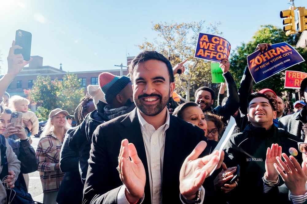
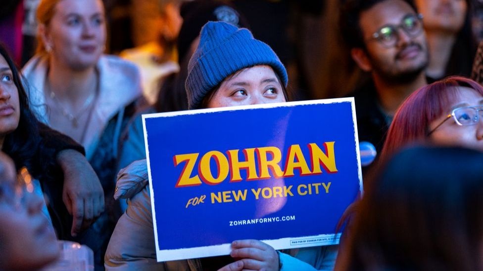
When Mamdani took the stage on election night, he was surrounded by a graphic that instantly became iconic: his campaign slogan, “Zahran for New York City,” displayed in warm yellow-orange and deep red. This visually captivating design spread throughout the city, appearing on street corners, storefronts, and various campaign materials. Mamdani’s team deliberately crafted the visuals to be deeply rooted in New York’s everyday life—from the iconic look of yellow taxis, to the charm of local delis, to the appeal of hot dog carts and the spirit of waterfront parks.

Mamdani emphasized the importance of these visuals, noting that they directly represented his campaign’s identity and intended audience. For a candidate who gained momentum through widely circulated online videos, visual storytelling was essential. Political design experts praised Mamdani’s strategy for breaking new ground, drawing comparisons to other standout campaigns that redefined political branding through distinctive visual elements.
According to renowned design educator Meta Newhouse, the vibrant color palette and unique typography of Mamdani’s branding delivered a powerful message: that his campaign was not about “traditional politics.” The handmade style of the lettering not only made the branding feel authentic and approachable but also communicated reliability and groundedness to the public. This design template was applied consistently across all campaign materials—from posters and social media graphics to shirts, scarves, and even soccer jerseys—ensuring a cohesive and unforgettable visual identity.
The campaign also benefited from a spirit of collaboration. After the primary, Brooklyn-based graphic designer Matthew Hinders-Anderson—who had previously volunteered for Mamdani—offered to create a digital font inspired by the signature logo. This crucial step allowed the campaign to maintain a unified and professional image across all communications. The mayor-elect continued embracing this design philosophy, using the same style for transition team announcements and even adopting a baseball-card format for posters.

From the start of his mayoral run, Mamdani was clear about his vision: he wanted something original, not a recycled political template. He specifically sought out visual artist and supporter Anish Bubathy, who runs a worker-owned collective and had spent a month in 2020 helping design materials for Mamdani’s first state assembly campaign. Their early partnership forged a strong connection built on shared late-night work sessions refining campaign flyers and palm cards.
Mamdani admired Bubathy’s innovation and creativity, viewing their work together as a chance to expand the boundaries of political design. In turn, Bubathy recognized Mamdani’s sharp design instincts—perhaps influenced by the creative women in his life, including his Oscar-nominated filmmaker mother and his painter wife, whose artwork has appeared in prominent publications. During remote design sessions, they carefully discussed imagery reflecting the spirit of a political campaign, ultimately choosing “Zahran” instead of “Mamdani” for the logo, highlighting the expressive quality of the letter “Z.”
The choice of “taxi yellow” was a deliberate reference to Mamdani’s previous activism, especially his 2021 hunger strike demanding debt relief for struggling taxi drivers. A deeper, possibly subconscious layer of inspiration came from Mamdani’s personal collection: Bollywood film posters, including the 1940 classic “Aurat.” Its bold red lettering and dramatic shadows subtly echoed the colors and stylistic elements in his campaign design. Although Bubathy noted he did not intentionally incorporate Bollywood references, he acknowledged the strong aesthetic influence that empowered him to “push boundaries” creatively.
This willingness to embrace creative risk became a hallmark of the campaign. Bubathy observed that it is rare for clients not to “polish down” early design concepts, but Mamdani embraced bold choices. His wife also contributed creatively—refining the letter “R” in Zahran to make it more distinctive. On election night, Bubathy, who traveled from Philadelphia, watched with great pride as his work culminated in the victory of his most prominent client. Having left New York five years earlier due to high living costs, the moment served as a powerful reminder of Mamdani’s agenda: making the city affordable for everyone—and perhaps even bringing Bubathy home again.